

Marvel vs DC Art Styles: What Is The Real Difference?
It is the oldest debate in every comic book shop on the planet. Who is better, Marvel or DC? Fans will argue endlessly about the characters, the movies, and the lore. But there is a much deeper conversation happening on the actual pages of the comic books themselves.
The art styles of Marvel and DC have historically been completely different. While modern digital coloring has blurred the lines a bit, the foundational drawing philosophies of these two publishers are totally distinct.
Let us look at what makes a DC comic book look like a mythology, and what makes a Marvel comic book look like an action movie.
[INFOGRAPHIC PLACEHOLDER: A split-screen visual analysis highlighting "The DC Look" (heavy shadows, god-like anatomy, muted grit) versus "The Marvel Look" (dynamic action lines, vibrant primary colors, kinetic energy).]
The DC Philosophy: Gods Among Men
DC Comics handles their characters like modern mythology. Superman, Wonder Woman, and Batman are essentially gods walking among mortals. Their art style historically reflects this massive, untouchable scale.When you look at classic DC artwork (think Jim Lee or Frank Miller), the characters are drawn with absolute anatomical perfection. They are statuesque. The inking is often heavier, creating deep, dramatic shadows that make Gotham City look terrifying or Metropolis look monumental. DC art focuses heavily on iconic poses. A full-page spread of Batman looking over a gargoyle is designed to look like a painting hanging in a museum. It is grand, dark, and highly detailed.
The Marvel Philosophy: The World Outside Your Window
Stan Lee and Jack Kirby built Marvel Comics on a completely different idea. Their heroes were flawed, everyday people who just happened to get powers. Spider-Man had to pay rent. The X-Men dealt with prejudice. The art style had to match that messy, human reality.Marvel art is defined by kinetic energy. Co-creator Jack Kirby literally invented a drawing technique called "Kirby Krackle" just to show the chaotic, crackling energy of cosmic powers. Marvel characters are rarely drawn standing perfectly still. They are twisting, swinging, and punching their way through panels. The colors are traditionally brighter, using vibrant primary reds, blues, and yellows to make the action pop off the page. It feels fast, frantic, and alive.
Star In Your Own Comic Book 💥
Why just read about superheroes when you can actually become one?
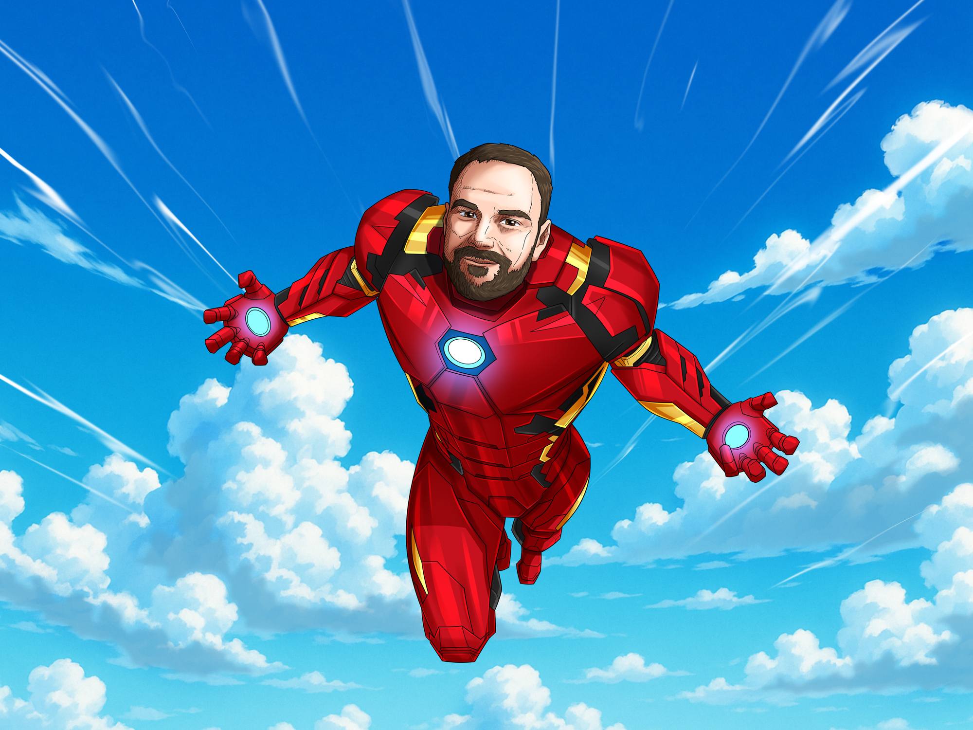
At TurnedComics, our professional comic artists take your photo and draw you into a high-octane superhero cover. Whether you want the gritty shadows of Gotham or the bright cosmic energy of an Avenger, we bring your superhuman alter-ego to life.
Turn Me Into A SuperheroThe Inking and The Colors
Historically, the printing techniques defined the publishers. In the early days, Marvel relied heavily on bold black outlines to separate their bright colors on cheap newsprint. DC often utilized tighter, more intricate line work to convey realism.Today, digital painting allows both companies to produce cinematic art. However, the core philosophies remain. A Batman comic will almost always lean heavily on negative space and heavy black ink to convey mood. An Avengers comic will lean on dynamic foreshortening (drawing a fist or shield flying directly at the reader) to convey action.
Which Universe Are You?
Are you drawn to the dark, mythic scale of DC or the bright, kinetic energy of Marvel? The beauty of comic book art is that you do not really have to choose. Both styles have shaped pop culture forever.[INFOGRAPHIC PLACEHOLDER: A timeline showing the evolution of comic book coloring from 1960s Ben-Day dots to modern digital gradients.]
If you are ready to hang a piece of superhero history on your own wall, send us your photo. We will draw you swinging, flying, or saving the city in your very own custom comic portrait.


